Building Salv's identity, part 2: producing the design

This post is part of a series on how we developed Salv identity. Also read the other posts in the series:
- Part 1: History, mission, and name
- Part 2: Producing the design
- Part 3: Developing Salv’s brand identity
Project structure and visual design
Now that Salv had a clear mission and name, it was time for the visual production part. Personally, I very much appreciate the importance of brand and the craft of making it. My own background and strength is more in product design, and I knew I wouldn’t be able to produce everything needed on my own.
A common step at this stage is to do a project with a specialist agency. I knew we had neither the funds nor time for a full brand project, nor did we really feel the need for many of the things that are typically done in such a project. As I mentioned in Part 1, we felt strongly about our name and mission, so that was done. Like many startups, it’s highly likely that, as we develop as a company and as an identity, we’ll need to do another brand iteration in a few years to add more depth and nuance. But at this point so early in the game, we just needed a strong partner to collaborate with, hop onboard our mission, and help do the execution and production with us.
When I realized we needed help, I immediately thought of Priidu Zilmer.
I first worked with Priidu at Skype back in the day. We’ve kept in touch ever since, and done many work and hobby projects together over the years. Priidu works as a freelance designer these days and I was delighted to find out that he was interested in Salv and had availability for us. Unsurprisingly, Priidu did most of the actual creative and production work in this project, deserves all the credit, and I cannot thank him enough.
Once everyone was agreed on Priidu, we kicked off the project. The team consisted of Priidu, myself, Jeff (one of Salv’s co-founders), and Tiina (our head of marketing and communications). We gave ourselves a few months to pull the whole thing off, realizing we all had other commitments and none of us would be full-time on the identity project.
We settled on a weekly cycle. We’d have a call every week where we’d go over the past week’s work and plan for the next week. We supported this with a Slack channel for any ongoing back-and-forth between ourselves and Priidu. After the call, Priidu would often go off to do research and production and then virtually bounce ideas around with us through the week. Myself and Priidu had additional syncs through the week about technical and practical matters as needed. It was all fluid, organic, and worked well.
Everyone’s favorite part, the logo
As Priidu suggested, our first order of business was to pick a logo direction to frame the whole brand and identity and inform most of the other work. He’d develop it first in monochrome, devoid of color and any other styling.
There are three styles of logos:
- wordmarks,
- literal/metaphor images
- abstract marks
We couldn’t think of a good metaphor for an image to use, and we’re not (yet?) able to deploy an abstract mark that the world would associate with us. That left us with the wordmark direction, which was fine, because Salv is a great name to work with. It’s short, and has good characters that easily lend themselves to interesting styling. Priidu set off to explore typographic options.
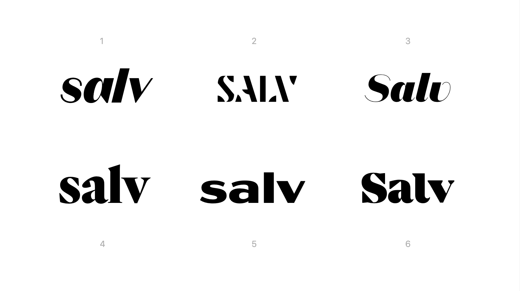
We explored many directions, and eventually ended up with two clear options. One was robotic/techy/mechanical, possibly grounding us into the space of future, machines, and technology.
The other direction was more rounded, connected, human, and with a script-like quality. Here’s an early sketch.
![]()
I felt this to be an important fork in the road. A fork that would inform not only the logo, but the whole Salv identity and story for quite a while. While the first version has potential for interesting letter shapes, angles and connections, we felt it spoke too much to technology, and too little to humans.
Sure, Salv uses and builds a lot of technology, but it’s not the heart of our crime-fighting mission. Humans are. The humans doing the crime-fighting. The humans are the victims of said criminals. And everyone who comes along on this journey is, at the end of the day, human. We need to align lots of minds globally, and our technology is just a small piece of this.
After more iteration and tuning, we arrived at the final hand-lettered wordmark.
![]()
It’s playful, unique, and has some easter eggs that we didn’t plan for at all. Can you spot the cat and the man looking at each other, embedded in the logo? How many logos do you know with an embedded cat picture? 😀
Now for the color and font
Having picked a logo direction, we next focused on picking colors and fonts.
We developed a vibrant color palette that worked well on both light and dark backgrounds.
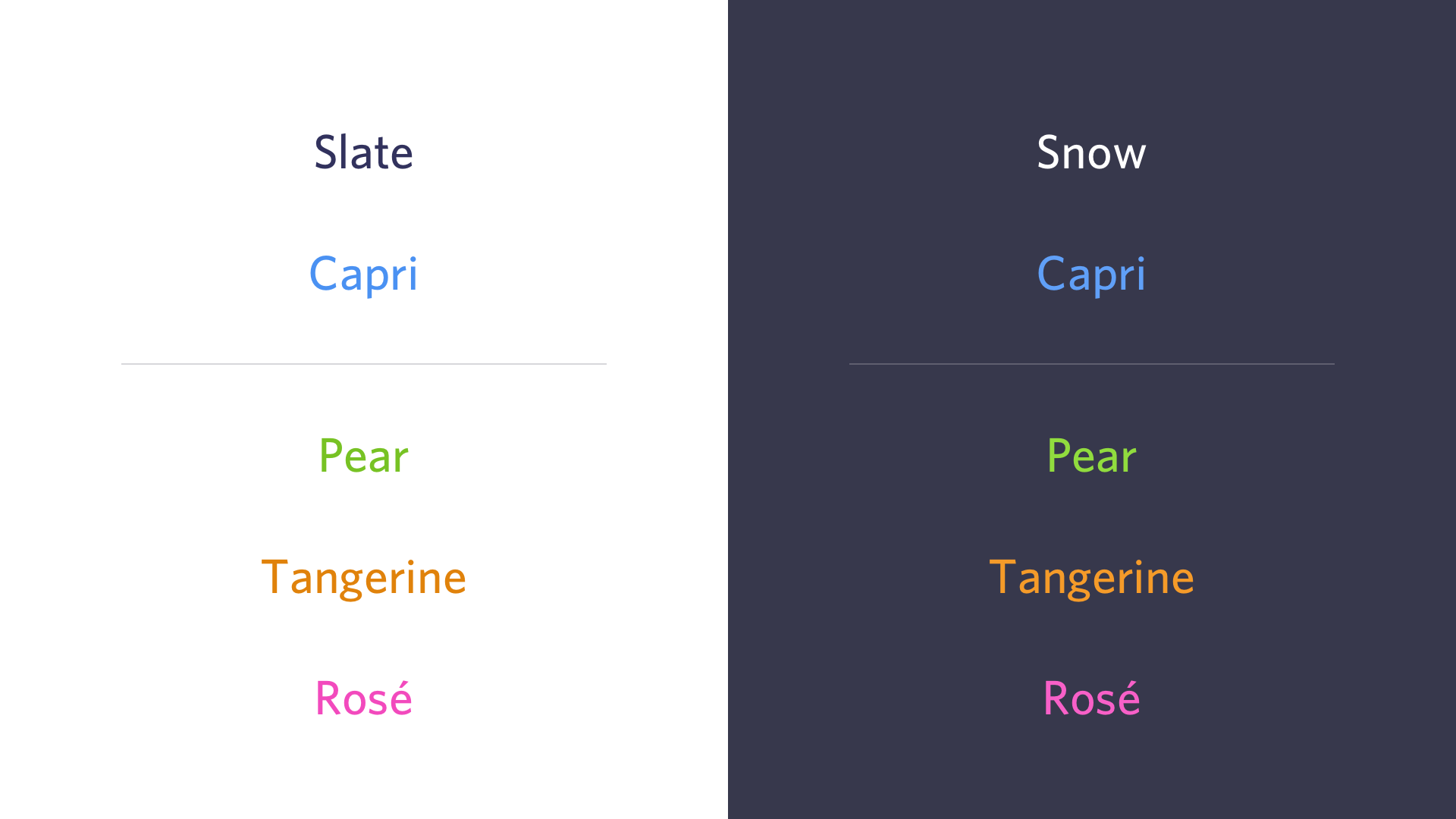
In parallel with the brand and colors, we were also working on our website and print materials so that we could test out the materials in context. We had both light and dark backgrounds on our website, and it was soon clear that we could’t have the exact same color set equally usable on different backgrounds. Thus, if you were to inspect the Capri, Pear, Tangerine and Rosé color codes, you’d find that they have slight differences based on the background. We have a darker version and a lighter version for somewhat better contrast and readability. Not all combinations are fully accessible from the contrast perspective, so we recommend using the more colorful ones with care, and with large enough text sizes for good readability.
There wasn’t much of an inquiry process to inform our colors. They don’t represent anything in particular. We just wanted to have a set that comes across as both professional and interesting, and is usable across various media. And, well, apparently Jeff was a bit sick of majority blue color palettes having come from both Skype and TransferWise.
We picked Whitney by Hoefler&Co as our main typeface. Brand identities often use several typefaces for different purposes, e.g by having a separate “headline” and “body” font. Whitney, however, is highly versatile and has many beautiful weights, such that we can use Whitney in various configurations for all our type needs.

Whitney is a commercially licensed font, and we obviously have acquired the needed licenses for both web and desktop use. We can’t use it in all situations, though, and Open Sans is a great alternative or fallback if needed. It’s similar to Whitney and quite versatile. But, more importantly, it’s usable pretty much everywhere, including the standard startup productivity suite of Google apps like Slides.
The colors and type lend themselves to interesting, bold, and beautiful combinations. Here’s a typical title slide from one of our presentations.

The font discussion applies only to our print and digital marketing materials, including our public website. For in-product use, there is an increasing movement over the past years to just use the system font stack.
If you’re curious, here are some relevant posts from CSS-Tricks and Booking.com on this. We’ve done the same, and it works well for us.
A technical note about Hoefler&Co ScreenSmart fonts
ScreenSmart fonts are a version of Hoefler&Co fonts that offer to improve readability on the web: “Specifically built for the screen, to perform at sizes from 9–18 pixels. Their forms are adapted to anticipate the effects of coarse pixel grids, and their styles are adjusted to ensure that each weight is appreciably different from the other members of the family.”
Sounds great, doesn’t it? Fonts optimized for the screen. We tried to use ScreenSmart fonts on our website, but it didn’t work out well, and we ended up not using them. We’re documenting this, so that if someone else happens to run into the same problem, this might be useful to know.
When we designed the layouts in Figma with desktop fonts and applied the designs with ScreenSmart fonts and CSS, we found out that the regular and ScreenSmart fonts have significant differences. At the same stated pixel size, the fonts are actually rendered at visibly different sizes and other metrics like weight. The design and web versions didn’t match. We’d have to hand-adjust the stated pixel sizes of the ScreenSmart fonts in CSS to get them close to the design in Figma and desktop fonts. But that would have been a tedious process and not a 100% match. We asked Hoefler&Co support about this, who were quick and helpful to respond and basically confirmed this is how it works.
In the end, we ended up abandoning ScreenSmart fonts and using the regular versions of Whitney fonts also on our website. This way, we could fully match the design and implementation, and wouldn’t have to do any size hacking. Fortunately, Hoefler&Co has a generous Cloud.typography option which provides a subscription to all of their web fonts for the same flat fee, including all versions of Whitney. So this switch didn’t have any impact to our costs.
Concerning readability, we just take care to pick appropriately large sizes of our fonts, make sure all the styling like colors and line height provides contrast, accessibility and readability, and carefully test on all our target platforms.


